
Flashcard App Prototype
Summary: We are furthering our UI/UX design knowledge by getting more involved with XD. I created vocabulary flashcards with HTML/CSS definitions, which are relevant to our work since they can help you code specific things for a web-related design. We had to create 35 cards with terms and definitions and a home screen to accompany our flashcards. I didn’t do the traditional flashcard version; I did one continuous one so the user could swipe up to interact with the flashcards.
Goals: My goal was to learn the ins and outs of XD I don’t have much experience and I need to get better at it. I was really dreading this project since we would mainly be designing using the program but after completing the project I have gained the knowledge of how to easily access my way around it.
Flashcard Design: I played around with many designs and layouts but decided simple would be better. I started with shapes and lines and more curvy lines, but I wondered about creating a simple element to the piece that would be a subtle touch that would make the viewer want to swipe up to discover the definition of the term they were learning about. If the design is too complicated, then the whole point of the flashcards would get lost. You don’t want to create something beautiful for the background, which becomes your subject when your subject is the term and definition.

Lo-fi Wireframe: Flashcards are pretty straightforward, so I needed to research what designs can be produced on this product type. I used Behance and Pinterest to conduct my research for this project. I saw a lot of fun colors and a consistent flow, so I decided not to go over the top with color as I had in our last project. Here, I realized that there are usually not many elements in a flashcard; therefore, I needed to keep it simple. The other thing I saw was that the front card (term) had the most decoration and color while the back card (definition) had the least. This makes sense since the part you want to learn is the main focus rather than the design being shown.


Med-fi Wireframe and Design System: There were a lot of hiccups in my preliminary design. I created a subtle shape of an arrow by rounding the corner of a rectangle with the word term in it. Later, I realized that it was a flashcard, so people were going to know which one was the term and definition, so I eliminated that and decided to bring down the weird slight shape so that it filled the whole screen with just the term in the middle. I still played around with my shapes, but I was having trouble deciding how many circles and what other little shapes I needed to add. Lastly, I didn’t want to just pick colors I liked. I researched colors and what went well together, which led me to what I feel is still a fun yet severe scheme of colors that work well with my design.


Final Design: To get my final design, I had to start testing my prototype. That means sending it to my phone to constantly see if everything works and if all my elements are spaced correctly and in the right place. It's different to design something made for a computer or a phone. You're used to seeing so much on a laptop, and you need to remember you're limited regarding how much space you have and see on a phone.

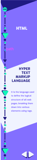
Navigation Map: My navigation is pretty simple. The user will be welcomed with a " Code Vocabulary home screen," leading them to a second screen with two groups. The group was built for the HTML vocab or the CSS vocab. When you finish each group, you will return to the second home page, and each home button will take you back to the beginning.
Design: Once I imported my design, the first thing I did was make all my design elements a component to help me when I needed something. Not only does this mean my shapes, but it includes the colors and fonts I used within my design system. Often, the components helped me when I had trouble with a button. I could easily drag out the elements I made, making designing much smoother.


Prototype: Pulling wires for a prototype is my favorite part because it’s so rewarding to see something you created that works when you click or drag it. It was easy since I could group everything, which helped me make sense of where everything needed to go. The only times it got weird was if I duplicated something strange and was still hooked to a different flashcard, making it not be in the correct order.

Final Work


Knowledge Gained: I used to think of graphic design differently from what I believe now. I used to think you needed to create something no one has ever seen before, something that would blow people away. But the longer I do graphic design, the more I realize I don't always have to be out-of-this-world creative. Sometimes, something so simple as a flashcard can be creative. As long as you have a strong design system, whatever you create will always be successful if you can design it well.


